session one:
Whilst making these changes i began making various others along the way. the print screens below show how i created my next draft in session one of improvments.
Session two: The next set of improvments was done on saturday the 12th of march. From the image above i made the following changes: bring image down, make masthead bigger, make the colour of the writing on the knife redder, make the text colour brighter, make the size appropriate. (21:29) A4. The images below show this.
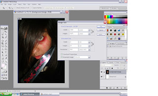 |
| Here i started again and changed the size of the canvas i was working on. |
 |
| This was the next improved version of my magazine cover. done on the 12th of march. |
Session three: This improvment session was carried out on the 16th of march. The improvments i had to make for this was to make the price,website,issue number smaller, make the word disconnected stand out, make the teasers different from each other so the text does not look like a list. change the image back to another edited one (it was very little difference, but when printed out on paper, the eye stood out more in the other image). Also i felt the layout of the words was a little off. for example 'teen horrors: the best & the worst', the best and the worst should be on one line rather then separted. this was also the case for the other teasers. So i changed the wording round a little.
 |
| here i am switiching the images |
 |
| here i am movign all text from the previous draft, to make new improvents. |
 |
| This print sceen shows me trying to make the word disconnected stand out from the other text around it |
 |
| In this version, i changed the layout around |
 |
| This is the final version of what i finished with in session three. |
Session four: I noticed a few more changes that could be made. I made a mistake of using paint bucket black on the image in the end of session three. as you can see from the magzine conver above, the top of the girls hair is painted. This was not meant to happen. Also the D in anticipated is missing. From session three, i will improve these points, as well as adding a footer at the bottom.
 |
| As the image was distorted in some places at the end of session three. i decided to start again and place everything back onto the original edited image. |
 |
| With a few tweeks done, this was my final magazine cover without a footer. |
 |
| I then placed this footer in and decided it was the right choic, as it allowed the magazine layout to flow right across the page. without the footer it just stopped like the text was listed. |
Session 5: This is my final session of improving my magazine. Not alot needed to be changed only to add a faded box behind the footer and possibly the skyline to break the text up. I may also play around with the colour of the disconnected teaser.


No comments:
Post a Comment